When someone is deciding whether a company is worth engaging with, a first impression is priceless. That first impression many times comes from the design associated with your company. You can see this in any industry and on any platform: website, social media, print materials, etc.
Design Communicates Legitimacy
If you are looking to donate to a nonprofit, many times you visit the organization’s website. If the first few things you notice are poorly designed graphics, difficult navigation, spelling errors and hard to read text, you might withhold your donation. The poor design and user experience has made you question the nonprofit’s legitimacy, consciously or unconsciously. You might start to wonder if your sensitive information will be safe. Your confidence and trust in this nonprofit has now been affected.
The same goes for any direct sales company.
Let’s face it: our channel has its share of reputation challenges and skepticism. You want potential customers and distributors to trust your company’s legitimacy from the get-go, and your design can help drive this assurance home.
Whether you are a start-up or you’ve been in business for decades, you should always assess your graphics to confirm they are top-notch and updated to reflect the current design standards.
Here is a list of nine graphic design tips you and your team should consider.
Tip 1: Leave Margin Around the Edges
You’ve probably heard of white or negative space before, especially in publication design. This is a section of a page or graphic that is left unmarked that provides breathing space for the eye.
Even though it is called white space, that doesn’t mean it literally has to be white. It just means “space” without any text or graphics (this excludes images that are purposely meant to fall off the page).
When you create any graphic, make sure there is plenty of space around all of the edges. You can look at a graphic and tell the difference between an amateur and experienced designer by the amount of margin they leave around the edges of their image.
Tip 2: Match Text Color Exactly to Your Image
When you are designing any graphic with text and an image, decide your color palette off of your image. You can easily do this by using the “Eyedropper” tool in Adobe Photoshop, Illustrator or InDesign. When you hover over a section of your picture, you can choose the exact color you want to pull from. This technique adds an extra level of consistency to your graphic and removes any guesswork on your part.
Tip 3: Use 2 Opposite Fonts
You’ve all heard the phrase that opposites attract. This also applies to font selection. You don’t want to use two script or two bold fonts together. A better option would be to use one script or bold font with a simple serif or san serif font.
Pro Tip: Another element to look for when choosing fonts is to match the edges of your fonts with the rest of your design. If your logo has round edges, find a font that also has round edges. Sometimes good design means breaking the rules, but this is a helpful place to start.
Tip 4: Always Design in the Correct Color Mode
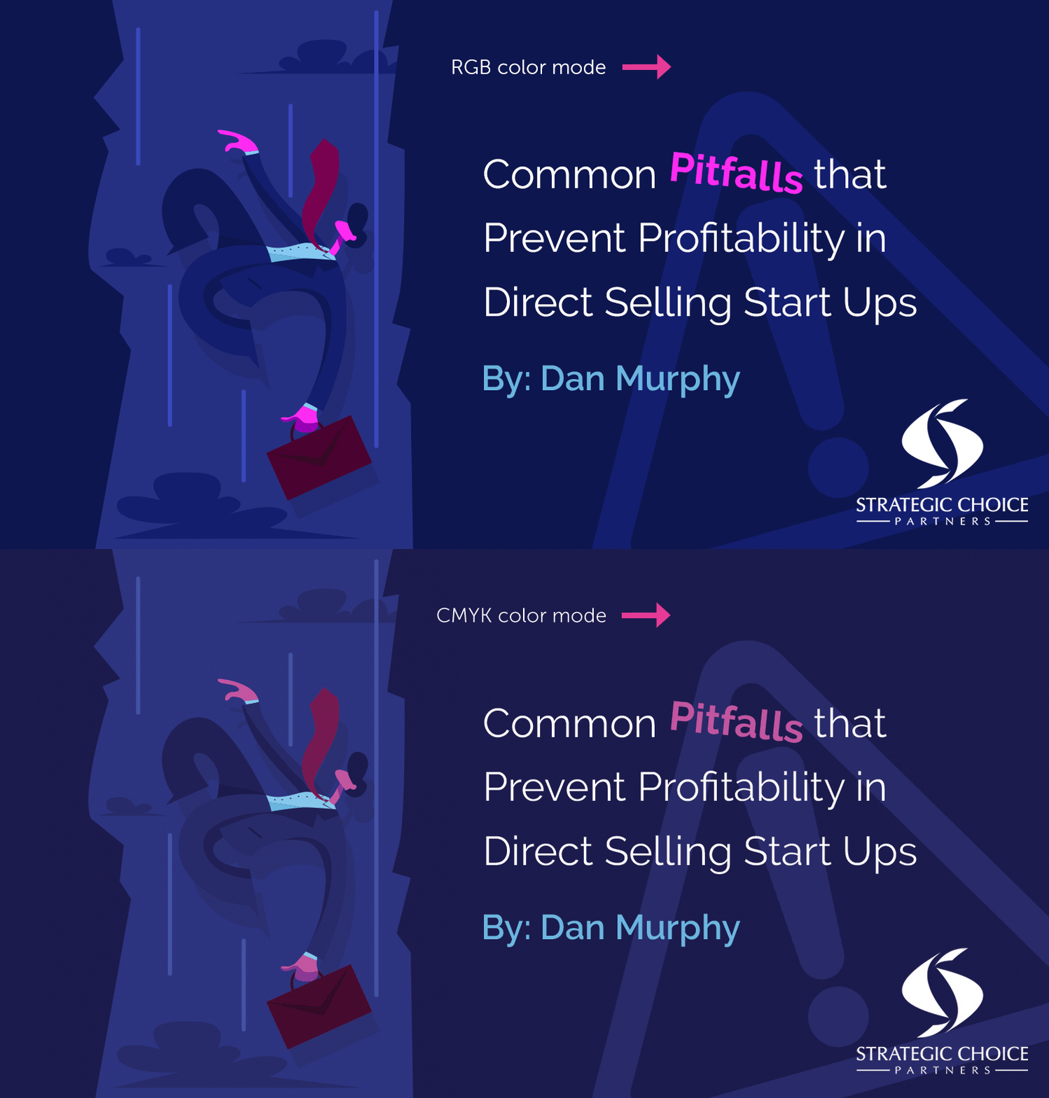
This is a simple one, and once you know the difference, you are good to go. When you are designing a graphic for digital purposes, create your file in the RGB color mode. When designing a graphic for print purposes, use the CMYK color mode. If you accidentally start building your file in the wrong color mode, you can always switch it.
The reason for designing in these color modes is so your graphics show up correctly. If you create a CMYK social media image, your image will look more muted in the program you are desiging it in, and you risk the colors saving incorrectly. Many times, your colors will turn a neon shade, which obstructs your beautiful design (even though the color is darker in the design program).
Tip 5: Never Use an Element That is Even Slightly Blurry
You want your design to be clean and crisp … always. Sometimes you are provided with low-resolution images in the first place, which can be frustrating. If this is the case, I always ask for a higher-resolution version first and make sure they know the consequences of using a blurry image … decreased legitimacy for their company. For example, you don’t see Apple using blurry images.
Recreate the Image
If a higher-resolution image isn’t an option and recreating the image is possible, create a vector version. I’ve done this with logos before. The company sent me a low-resolution JPG logo, so I spent an hour recreating their logo in vector format. I was then able to send the company this file for them to use on future projects.
Enhance the Image
If recreating a vector version isn’t an option, you can use the “Sharpen” tool in Adobe Photoshop. If this doesn’t sharpen the element enough, use the “Sharpen More” or “Smart Sharpen” tool next.
Tip 6: Make Sure Everything is Readable
First, you want to confirm you can read all of your text from a smaller view. Once you’re done designing, adjust your screen view to 50%. If you can read everything, your graphic has passed the test. This might require you to get up close to your screen and squint your eyes. That’s ok because if you can read it at 50%, you can for sure read it at 100%, which is what actually matters.
Second, make sure there is enough contrast between your text and the background, especially if the text is white or a lighter color. If the contrast isn’t very clear, you can try adjusting the weight of your text to make it thicker. Or you might have to darken your background color.
When I have to add footnote text to the bottom of a picture, and it is hard to read, I like to paint a black stroke at 0% hardness in Adobe Photoshop behind the text and decrease the opacity until it looks natural. This increases the contrast between the text and the background.
Lastly, have a friend look at your graphic. If you are unsure if your text is readable, have someone else follow the first tip under this section. Another benefit of having someone else look at your graphic is to make sure your design itself is readable. Many times, I’m so focused in on the logo I just created, I lose sight of its readability.
For example, I was designing a monogram logo where I was trying to cleverly combine three letters to make the shape of a family. I was so laser-focused on manipulating the letters to make this picture that the design’s readability was slowly declining. I showed my husband the design before I sent it to the client, and he had no idea what letters he was supposed to be reading. So I had to go back to the drawing board on that project.
Tip 7: Find a Style and Stick With It
I was reading a designer’s blog one time, and he made the suggestion that when you are first starting out on a project, you might experiment with a lot of different shapes, textures, fonts, etc. However, once you’ve honed in on a style that fits, stick with it. This provides consistency for your potential customers so when they see your graphics over and over again, there is brand recognition even before they see your logo.
Tip 8: Check Your Tracking, Kerning and Leading
Tracking, kerning and leading have to do with the space between your text. I oftentimes get these terms confused, so here are the definitions below:
- Kerning: Spacing between individual letters
- Tracking: Spacing between groups of letters or words
- Leading: Spacing between lines in a paragraph
A design is never complete until these three elements have been considered.
Pro Tip: When working with script fonts, there is almost always a perfect tracking number. You don’t ever want to increase the tracking between script letters so that the letters no longer connect. Instead of messing with tracking, you will more commonly adjust the kerning between one or two letters.
Tip 9: Use Unsplash for Free Pictures
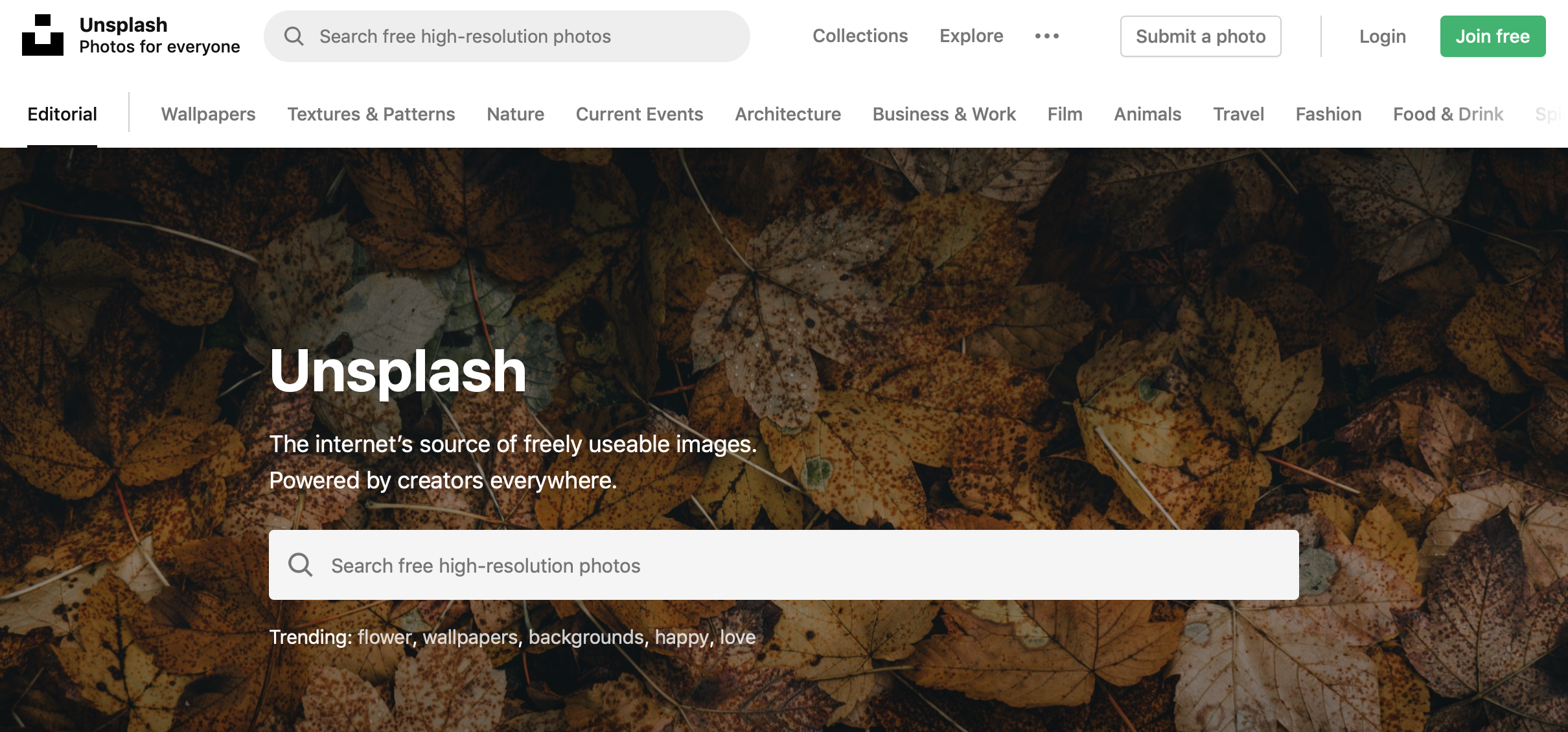
This last tip is mainly for start-up direct sales companies. If you don’t have a stock photography account just yet, Unsplash.com is a great option for free high-resolution images. When it comes to licensing, the Unsplash website says …
“You can use them (photos) for commercial and noncommercial purposes. You do not need to ask permission from or provide credit to the photographer or Unsplash, although it is appreciated when possible.”
Next time you start designing a graphic for your company, keep these tips in mind. If you are asked to give feedback on a design, you now have a few areas you can asses. You want your potential customers’ first impression to be positive, and part of a positive first impression is communicating legitimacy and trust. An easy way to communicate that is through design, so make sure it is prioritized at your company.
Need Graphic Help?
Need some help with your company’s design and creative work? Reach out to Brooke and the rest of the creative resources at SCP. We provide everything from design, copywriting, website design and video production, and we specialize in doing it for direct sales companies. Contact us right now to find out what’s possible.
About Brooke Hawkins

Brooke Hawkins is the owner of Hawkins Design Co, a boutique design agency that specializes in marketing and graphic design, catered to direct sales companies. Brooke has worked with numerous companies using omnichannel marketing to help businesses develop a consistent and memorable brand across all platforms from social media to web design to print materials and advertising.
Learn more about Brooke on her bio page, and contact us at info@strategicchoicepartners.com if you’d like to discuss how Brooke and SCP can help your company.


Leave a Reply